

If Ontario won't publish pie charts for hospitalizations by vax status then I will
If Ontario won't publish pie charts for hospitalizations by vax status then I will
ICU Patients - Vaxxed Vs. Unvaxxed

The Ontario COVID-19 vaccinations data page (https://covid-19.ontario.ca/data) now says, "This page is no longer updated." Visitors are directed to, "please visit the Data Catalogue or the Public Health Ontario Data Tool" for the latest COVID-19 data.

On June 2, the COVID-19 vaccinations data page showed that 88% of ICU patients were vaccinated for COVID.
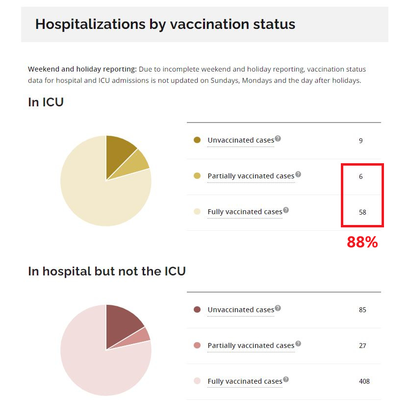
Interestingly, the last update on June 10th dropped to 74% and this is the pie graph total that has been left visible on the now static page. Also interesting to note is that the latest data for June 11th shows 85% of ICU patients are vaccinated for COVID. Now that we have to pull this view from the data ourselves I thought I would generate a pie chart to share.

Going forward I will continue to create and publish this pie chart here for people to reference. If not daily then every few days or at a minimum once a week. Hopefully this is one small way in which I can help all of us to crowdsource the truth.